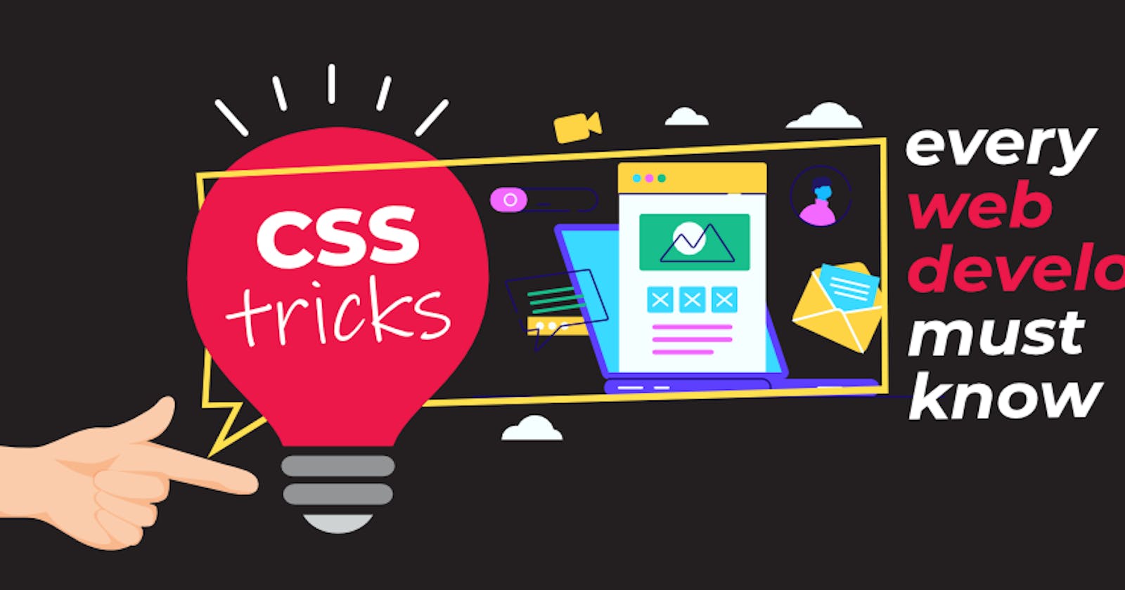
10 CSS tricks every frontend web developer should know!
Boost your CSS game with these tricks!


Hello and welcome! 🤩🤩
Are you ready to take your web development skills to the next level?
Look no further than using Cascading Style Sheets (CSS), the fundamental technology that transforms boring HTML into visually stunning and interactive web experiences. But don't stop at the basics!
In this article, I discussed 10 essential CSS tricks that will help you create more dynamic, responsive, and visually appealing websites. Get ready to unleash your creativity and take your web design game to new heights!
Flexbox and CSS Grid:
Take your web designs to new heights with Flexbox and CSS Grid! These powerful layout tools simplify complex layout challenges. Flexbox is perfect for arranging elements within a container, while CSS Grid allows for two-dimensional layouts with rows and columns. By mastering these techniques, you can create intricate, responsive layouts with ease.
Custom Properties (CSS Variables):
CSS Variables, also known as custom properties, are the ultimate solution for maintaining your styling in a sustainable way. With variables, you can define reusable values across your stylesheets, which means you can easily update design elements such as colors, spacing, and typography. This promotes consistency and simplifies maintenance, making it easier to make global changes. Get ready to streamline your styling with the power of CSS Variables!
:root {
  --primary-color: #007bff;
}

.button {
  background-color: var(--primary-color);
}
Pseudo-classes and Pseudo-elements:
Rev up your website's style with the latest CSS Variable updates! Take control with interactive styling using powerful Pseudo-classes (such as :hover, :focus, :active) and Pseudo-elements (such as ::before, ::after). Now you can customize your site's appearance based on user interaction, creating an exhilarating experience for your visitors.
Transitions and Animations:
Transform your website into an exciting and interactive platform with virtual elements and visitor interaction. Take your designs to the next level with the magic of CSS transitions and animations that bring your website to life with smooth and engaging motion effects. Get ready to experience the wow factor with the transition property and @keyframes property that enable you to create delightful user experiences.
Responsive Design and Media Queries:
Nowadays, with so many devices available, websites need to be able to adjust to different screen sizes. This is where media queries come in - they allow websites to change their style depending on the device being used. By using this technique, your website can look great no matter if it's being viewed on a smartphone or a desktop computer. This approach is modern and ensures that everyone can access and enjoy your website.
/*The media query below implements
styles for when the screen is


from a width of 0px to 768px*/
@media (max-width: 768px) {
  .navbar {
    display: none;
  }
}
CSS Blend Modes:
Discover the magic of CSS blend modes and create unique designs with ease! By simply clicking a few buttons, you can merge images and elements in ways you never imagined. These blend modes will elevate your designs to the next level, enabling you to create striking overlays and creative compositions. Let your imagination run wild and experience the full potential of CSS blend modes!
Filter Effects:
Unleash your creativity with the power of CSS! Imagine the endless possibilities of adding overlays and creating breathtaking compositions. Let your imagination soar and experience the full potential of CSS blending modes. It's time to bring your ideas to life!
Scroll-Snap:
Scroll-snapping is a CSS feature designed to improve page navigation. It makes scrolling smoother and helps users move between different sections of content more easily. This feature is especially helpful for single-page layouts and image carousels, as it snaps each section into place as the user scrolls.
.scroll-container {
  scroll-snap-type: y mandatory;
}
.section {
  scroll-snap-align: start;
}
Sticky Positioning:
Picture this: You're scrolling down a webpage and suddenly, certain elements start following you. Thanks to the "Sticky Positioning" property, you can create fixed navigation bars or other elements that stay put as you explore the page. It's like having your own personal guide that never leaves your side.
CSS Variables for Dark Mode:
Dynamic Theme Switching Using CSS Variables alongside JavaScript, you can implement dynamic themes, like dark mode, that users can toggle on and off. This enhances user experience by providing a comfortable viewing option in different lighting conditions.
:root {
  --background-color: white;
  --text-color: black;
}

.dark-mode {
  --background-color: black;
  --text-color: white;
}
body {
  background-color: var(--background-color);
  color: var(--text-color);
}
Conclusion
Unleash the full potential of your web development skills with these game-changing 10 CSS tricks! Take your user experience to the next level by implementing dynamic themes, such as dark mode, using CSS Variables alongside JavaScript. Your users will love the ease of toggling between comfortable viewing options in any lighting condition. It's time to up your game and become a master of these essential techniques.
Thank you for dropping by today! See you again soon.